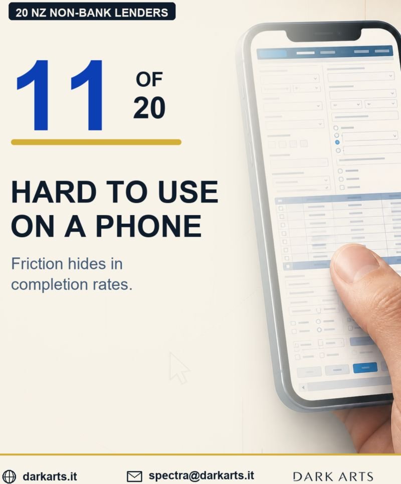
On a big screen with a cursor, every button is easy to hit. On a phone, some of those same buttons are small, close together and easy to miss.
You have probably felt it yourself: zooming in to tap a link, catching the one beside it, backing out and trying again.
Your customers feel it too, usually at the worst moment: partway through an enquiry, on a small screen.
None of this shows up at the office. The site looks right on every monitor in the building. The friction only exists in the customer’s hand, and it shows up mainly as fewer completed enquiries.
We reviewed 20 New Zealand non-bank lenders: 11 had phone-sized pages with buttons or links that were too small or too close together to tap reliably.
In several cases, the home page was fine. The problems sat further in, on the product, calculator or application pages where the enquiry actually happens.
The fixes are usually practical: make buttons big enough for a finger, give them space, keep the page steady while it loads, and walk through your own enquiry on a phone.
If you want to see what your public website is quietly costing you, get in touch and I will send you a free one-page report.