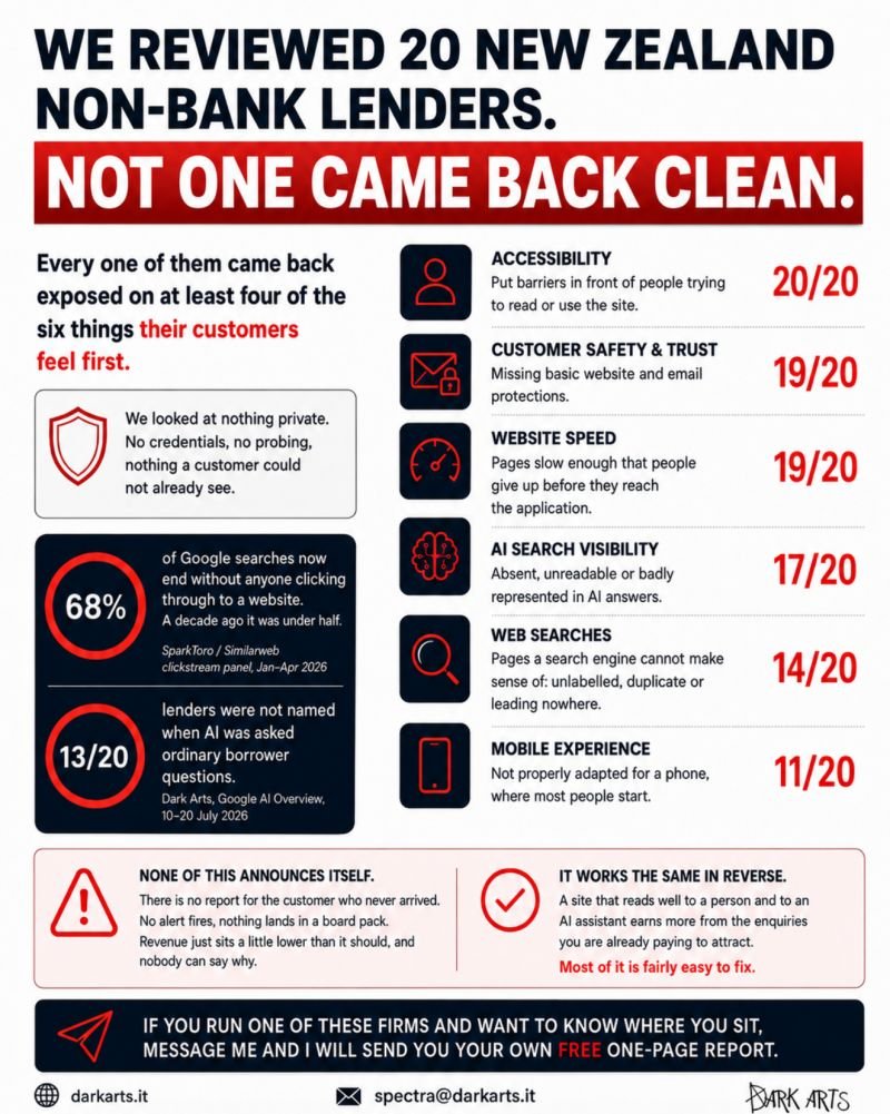
Every one of them came back exposed on at least four of the six things their customers feel first.
We looked only at what any member of the public could see:
- 20 of 20 put barriers in front of people trying to read or use the site, including enquiry and application forms.
- 19 of 20 are missing basic website or email protections, and in many cases, there was little to prevent someone sending email in the lender’s name.
- 19 of 20 have pages slow enough to lose people before they reached the application.
- 17 of 20 are absent, unreadable or badly represented when an AI assistant answered ordinary borrower questions.
- 14 of 20 have pages that search engines could not properly understand because they were unlabelled, duplicated or led nowhere.
- 11 of 20 are not properly adapted for a phone, which is where many customers begin.
The commercial effect is easy to miss because most customers will not report any of this. They simply leave, choose another lender or fail to complete the application.
From inside the business, that usually appears as fewer enquiries, lower conversion and weaker revenue.
The same effect works in the other direction. A site that is easier for people, search engines and AI tools to understand converts more visitors into enquiries and applications.
Many of the issues we found are relatively straightforward to fix.
If you run one of these firms and would like to see how your site performed, get in touch and I will send you a free one-page report.