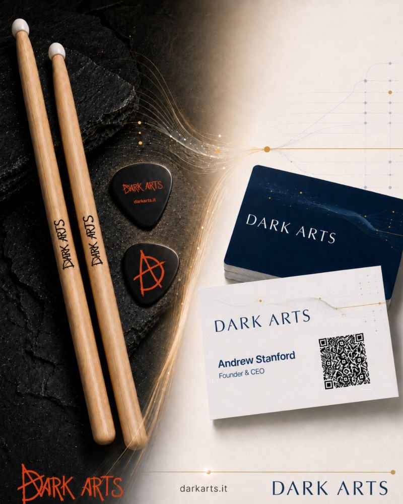
Our business adviser rather cautiously suggested that our branding made him picture a heavily tattooed man in a black room with an altar.
He said that brands can roughly fit into three buckets:
- The rare ones that are catchy and carry through everything the company does
- The professional ones nobody feels strongly about, but everybody trusts
- The ones that make some people pause before they pick up the phone
He put us in the third bucket and when your business builds and modernises financial systems, having potential customers pause before picking up the phone probably isn’t ideal.
For the record I have only one tattoo and the black room is a home theatre.
That dark, edgy and hopefully memorable logo was me: multi-instrumental dude with an occasional taste for some very heavy genres. I loved that our marketing handouts included guitar picks and drumsticks.
I had to start asking whether it was doing the right job for the business.
The result is the new Dark Arts branding we’re rolling out now.
Is it quite as outrageous or memorable as the old one? Probably not.
But I think we’ve moved firmly into that middle bucket: distinctive enough to still be Dark Arts, but looking much more like the trusted technology partner we actually are.
I’d love to hear your initial impression on old vs new. See the image.